Try GOLD - Free
Sitting pretty
Living Etc UK
|February 2025
What most deserves the attention - the glowing gold cabinet? The low-but-statement-making purple-y dark red storage? The touch-me-touch-me velvet of the pale red chair? The subtle textures and alluring materials all around? Step back and enjoy it all at once which is how it was designed, of course and it comes together like a puzzle, each piece neatly clicking into place.
-
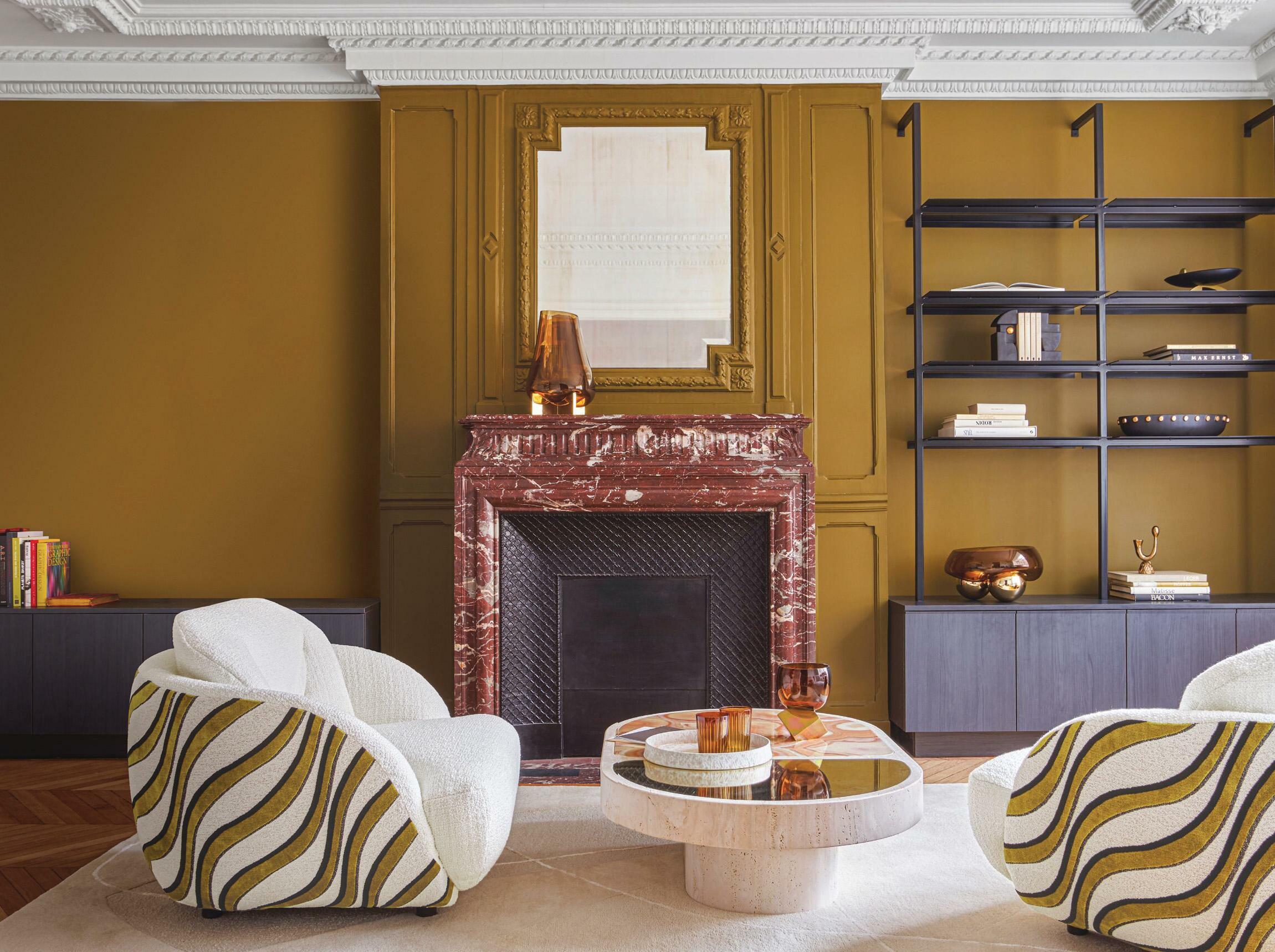
This room is arguing with itself.
Okay, it's more like a friendly debate or some playful teasing, but there's a slight ruckus, an undercurrent of a tussle, as the dramatic textures and tones strike intense contrast with one another. Warm versus cold. Colour versus neutrals. Slick versus textured. Organic versus machined. Rustic versus new. Soft versus hard. 'The cool tones are contrasted with the warmth of the brass cupboard, and the warm, neutral palette is grounded with a pop of deep burgundy joinery,' says Julie Niass, design director at Australian firm Carter Williamson Architects, creators of this space. 'The colours make the room feel warm and inviting, elevated and sophisticated, while the mix of materials adds texture, embracing light and shade.'

This story is from the February 2025 edition of Living Etc UK.
Subscribe to Magzter GOLD to access thousands of curated premium stories, and 10,000+ magazines and newspapers.
Already a subscriber? Sign In
MORE STORIES FROM Living Etc UK

Living Etc UK
RHYTHM OF THE NIGHT
A NEW, CIRCADIAN-BASED MICRO TREND IN AMERICAN LIGHTING IS SHINING A SPOTLIGHT ON HOW TO ENHANCE BRITISH HOMES TOO
3 mins
January 2026

Living Etc UK
House rules
As the ultimate tastemaker and founder of Collagerie, Lucinda Chambers knows how to curate perfect moments - this is how her home is always party-ready
1 mins
January 2026

Living Etc UK
FITTED & KITTED
DESIGNERS SHARE SAVVY WAYS TO USE BUILT-IN FURNITURE FOR A HOME THAT'S BEAUTIFULLY ORGANISED
3 mins
January 2026

Living Etc UK
BEHIND THE CURTAIN
THE SHELF SKIRT BRINGS A SOFTER SIDE TO YOUR HOME'S STORAGE - WHILE HIDING YOUR LESS AESTHETIC CLUTTER
1 min
January 2026

Living Etc UK
the big idea
NEAT AND TIDY
1 min
January 2026

Living Etc UK
the hot spot
AMERICAN DREAM
1 min
January 2026

Living Etc UK
Dinner plans
Banquette seating, sculptural tables and more – these are design ideas to dine out on
2 mins
January 2026

Living Etc UK
buy one thing
BEDSIDE COMPANION
1 min
January 2026

Living Etc UK
Joie de vivre
Creating sophisticated interiors doesn't always mean taking a serious approach – just look at this very chic Parisian apartment and its happy-go-lucky vibe
4 mins
January 2026

Living Etc UK
Present and correct
The chicest homes are those where art, objets and niche collections are curated and on display for all to see
1 mins
January 2026
Listen
Translate
Change font size