emerging idea PICK YOUR POISON
Living Etc UK
|May 2023
The art theory known as 'poison colour' goes to prove that there can be nuance in choosing a contrast hue for your scheme, says Hugh Metcalf

Do you remember when the colour pop' phenomenon started? At the time, a collective love for colour was gradually seeping back into interior design, but it was before we reached the bold saturation of spaces that we're seeing inform interior design trends in the present day. The idea is a very simple one you bring some life and energy to your colour scheme by introducing an accent 'pop', usually a bright complementary shade that ensures your overall palette doesn't feel flat. The most well-known example is probably grey and yellow-a colour combination that at one time had a grip on our homes, but has now slowed down in the style stakes.
It's fair to say that the approach to using colour in the home has grown much more sophisticated as we move through the 2020s. Colour palettes have become more nuanced, creative and experimental, and the fear associated with using an abundance of colour (often linked to concerns over a home's possible resale value) has faded over time. However, the one constant is the desire for a room's colour scheme to feel energised and invigorated, not flat and toneless. But without falling back into the single-colour pop situation, how do you approach making an unexciting colour palette come to life?
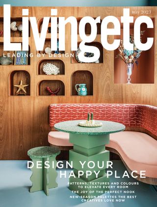
This story is from the May 2023 edition of Living Etc UK.
Subscribe to Magzter GOLD to access thousands of curated premium stories, and 10,000+ magazines and newspapers.
Already a subscriber? Sign In
MORE STORIES FROM Living Etc UK

Living Etc UK
RHYTHM OF THE NIGHT
A NEW, CIRCADIAN-BASED MICRO TREND IN AMERICAN LIGHTING IS SHINING A SPOTLIGHT ON HOW TO ENHANCE BRITISH HOMES TOO
3 mins
January 2026

Living Etc UK
House rules
As the ultimate tastemaker and founder of Collagerie, Lucinda Chambers knows how to curate perfect moments - this is how her home is always party-ready
1 mins
January 2026

Living Etc UK
FITTED & KITTED
DESIGNERS SHARE SAVVY WAYS TO USE BUILT-IN FURNITURE FOR A HOME THAT'S BEAUTIFULLY ORGANISED
3 mins
January 2026

Living Etc UK
BEHIND THE CURTAIN
THE SHELF SKIRT BRINGS A SOFTER SIDE TO YOUR HOME'S STORAGE - WHILE HIDING YOUR LESS AESTHETIC CLUTTER
1 min
January 2026

Living Etc UK
the big idea
NEAT AND TIDY
1 min
January 2026

Living Etc UK
the hot spot
AMERICAN DREAM
1 min
January 2026

Living Etc UK
Dinner plans
Banquette seating, sculptural tables and more – these are design ideas to dine out on
2 mins
January 2026

Living Etc UK
buy one thing
BEDSIDE COMPANION
1 min
January 2026

Living Etc UK
Joie de vivre
Creating sophisticated interiors doesn't always mean taking a serious approach – just look at this very chic Parisian apartment and its happy-go-lucky vibe
4 mins
January 2026

Living Etc UK
Present and correct
The chicest homes are those where art, objets and niche collections are curated and on display for all to see
1 mins
January 2026
Translate
Change font size

