Try GOLD - Free
PERSONAL PALETTE
Home Beautiful
|July 2025
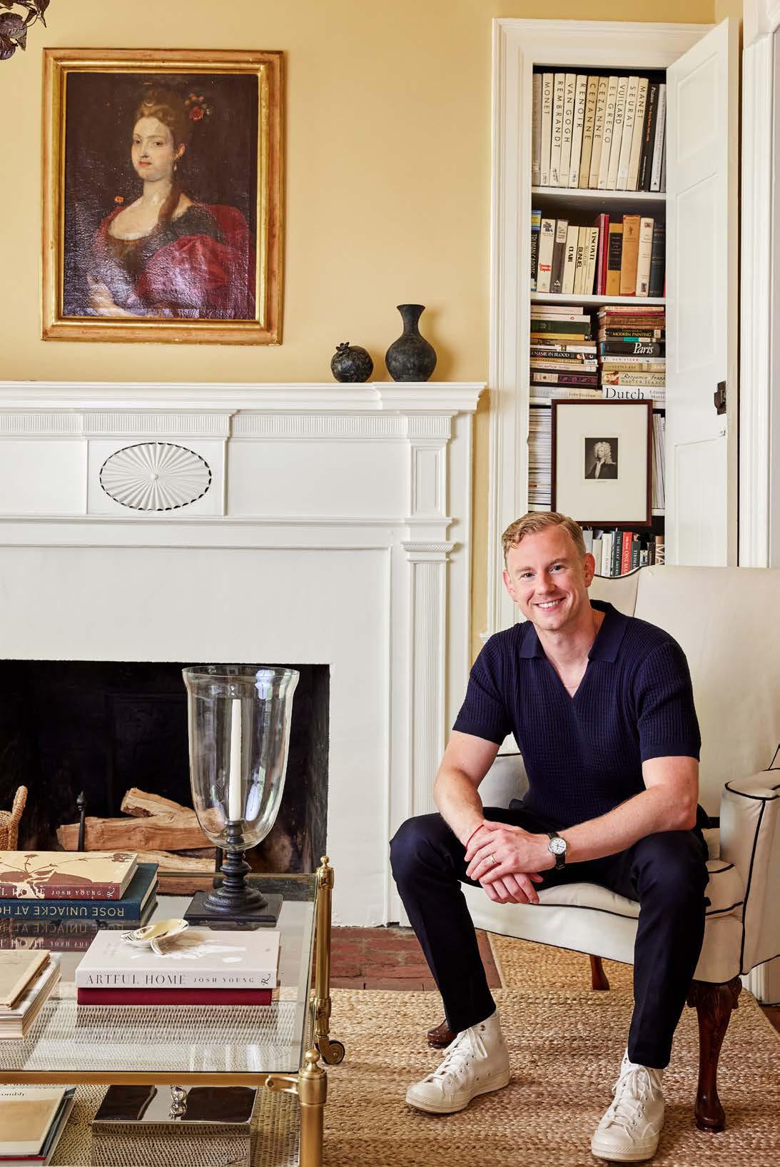
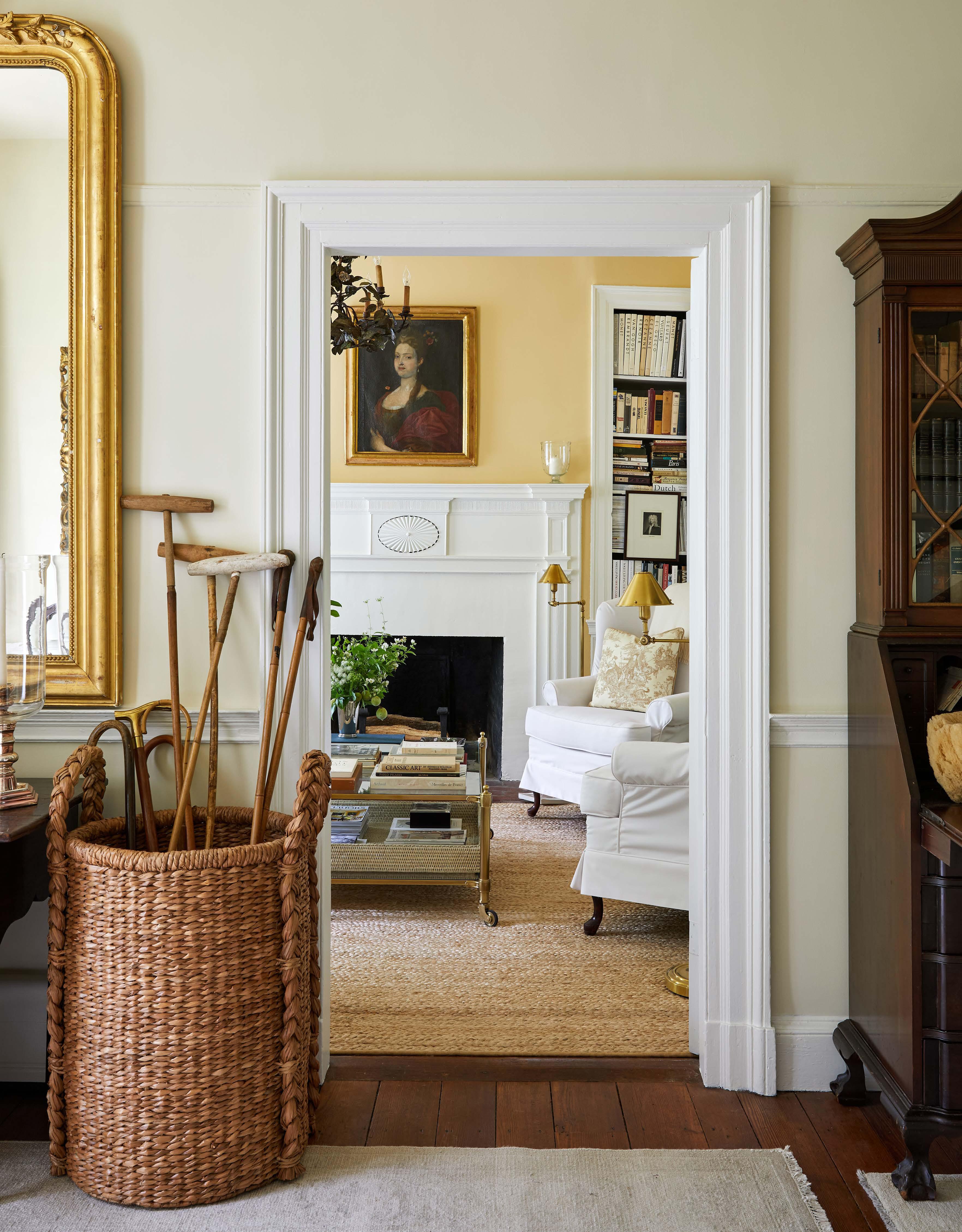
On the softer end of the colour spectrum, neutral hues can make as strong a statement as bolder colours and are easily adaptable to any style of home. But there are some techniques to getting it right. In his new book, Artful Home, American designer and artist Josh Young takes us through the houses he shares with his husband Ignacio, and explores what makes an artful interior - the keystones in his artistic and creative approach both in the studio and at home: palette, texture, form, layers and nostalgia.
One of my favourite things to do is to lay out a variety of objects and see how their colours work with one another. Observing the way textiles or tubes of paint interact has always intrigued me. Whether I’m in the studio beginning a new painting or sourcing for an upcoming interior project, I begin by establishing the palette. There’s a certain magic that occurs when the right combination results in harmony and balance.
Palette matters. Used repeatedly, a set of colours can become a recognisable part of one’s design DNA. A specific and intentional palette helps to tell a story and create a mood. In my work, I look to neutrals and a monochromatic, restrained arrangement of colour. Regardless of trends, neutrals — off-white, ivory, ecru, tan and brown — are my go-to. It’s a subtle range that feels natural, light and grounded. These combinations are instinctive to me. Identifying my personal palette was key to establishing my own signature look.
As much as I love neutrals, I don’t avoid colour. However, I apply the same discipline and restraint to working with colour that I do with neutrals. Ever the purist, I love each colour to have its own moment — to be appreciated and prominent on its own without competition. For me, adding too much colour to a room creates noise and a heightened sense of visual distraction. I can certainly appreciate it, and I love to visit rooms filled with it. But I can’t live in it. In my home, I use a single shade in a room, allowing it to take centerstage through something as simple as upholstery or paint on the walls. When everything else around the colour is kept more subdued, the colour acts as a neutral.
 Colours with meaning
This story is from the July 2025 edition of Home Beautiful.
Subscribe to Magzter GOLD to access thousands of curated premium stories, and 10,000+ magazines and newspapers.
Already a subscriber? Sign In
MORE STORIES FROM Home Beautiful

Home Beautiful
EASY, breezy
Create less cleaning fuss in the future with our tips for designing a low-maintenance bathroom
3 mins
January 2026

Home Beautiful
OUT of the BOX
These mini beauty sets make for the most magical Christmas stocking stuffers
2 mins
January 2026

Home Beautiful
Eat & be MERRY
In her new book, The Christmas Companion, food writer Skye McAlpine shares her cooking and hosting secrets, from planning the perfect menu to sorting your seating plan
10 mins
January 2026

Home Beautiful
Season's eatings
With her signature colour and culinary skills, Melbourne creative Jessica Nguyen prepares her Edwardian home for Christmas
6 mins
January 2026

Home Beautiful
MAKING MEMORIES
In a popular pocket on the South Coast of New South Wales, Rachel and Ryan Carr have created a holiday retreat
4 mins
January 2026

Home Beautiful
3 festive wrapping tips with...BESPOKE LETTERPRESS
As the founder of luxury stationery and lifestyle brand Bespoke Letterpress, Alischa Herrmann, pictured, knows the art of stylish giving - here are her top tips for making every present truly special
1 min
January 2026

Home Beautiful
In good cheer
Celebrate the holidays and ring in the New Year with style, courtesy of our resplendent round-up of precious drops
1 min
January 2026

Home Beautiful
Wreath the ROOM
In a new artistic chapter, Sarah Stamm unveils a range of limited-edition prints, depicting Christmas wreaths she made by hand
2 mins
January 2026

Home Beautiful
BUSH THERAPY
Joy and connection sprout among the edibles in this Rutherglen garden, which is designed as a healing experience
4 mins
January 2026

Home Beautiful
Home, sweet home
Catriona Rowntree travels the globe for her television role as a host of Getaway, but home soil at her family farm in Victoria is where her heart is – especially at Christmas
6 mins
January 2026
Listen
Translate
Change font size