Try GOLD - Free
Perfect Palettes
SquareRooms
|October 2020
Giving your home a makeover? Flip through these stunning colour combinations to find the ideal hues for all of your living spaces

Bold tones
Vibrant pairings to add plenty of personality to your space
Red and white
While red is one of the strongest colours you can pick for your home, contrasting it with white helps to tone down the overall look. Even in the bedroom, this combination can be quite elegant and rather rejuvenating—something you probably wouldn’t expect with such a vibrant shade!

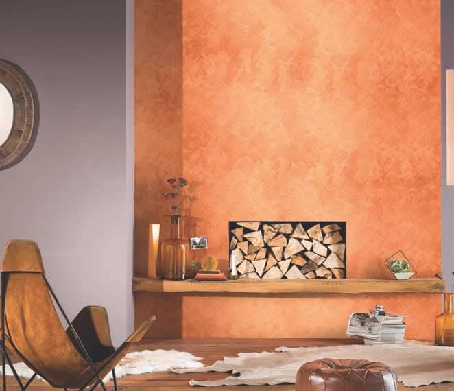
Orange and purple
These two shades complement each other particularly well, resulting in an eye-pleasing look. If you want to take things even further for that extra kick, consider lending texture to one of the two hues.

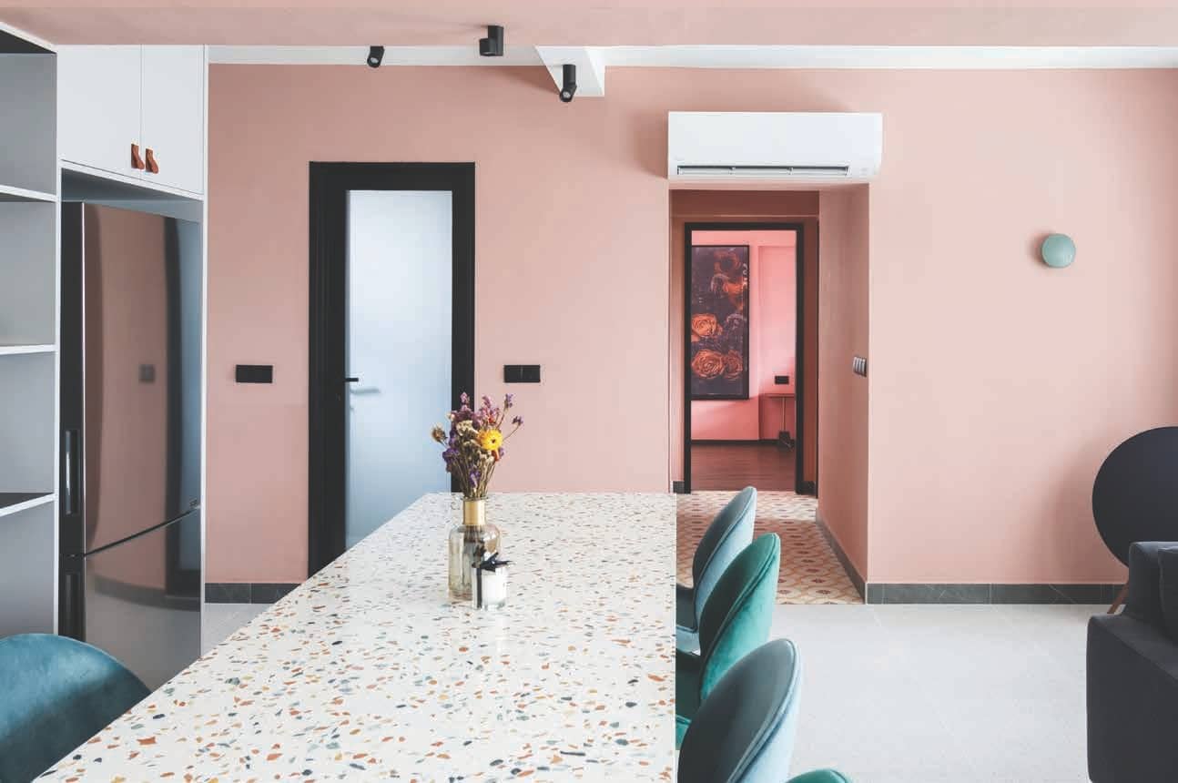
Teal and pink
One of the most underrated colours in interior design, pink is incredibly versatile and pairs well with a host of other shades. Combining it with teal and other blue tones has got to be one of our favourite applications, resulting in an uplifting environment that always looks fresh and welcoming.

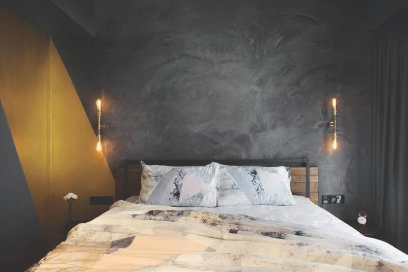
Black and yellow
This story is from the October 2020 edition of SquareRooms.
Subscribe to Magzter GOLD to access thousands of curated premium stories, and 10,000+ magazines and newspapers.
Already a subscriber? Sign In
MORE STORIES FROM SquareRooms

SquareRooms
I.D.I.D
From material exploration in luxury homes to guiding younger designers toward stronger creative voices, 2025 marked a season of growth and clarity for I.D.I.D Studio. Here, Wynn reflects on the year's highs, challenges, and the design values she hopes to carry into 2026.
3 mins
Annual Issue 2026

SquareRooms
Modern Luxe Meets Brutalist
From a pool table to a glass-encased planter, bold design choices turn this home into a stylish space to play, dine, and unwind.
3 mins
Annual Issue 2026

SquareRooms
A Soft Minimalism That Breathes
From glass blocks to patterned tiles and soft lines, this home is proof that the cream aesthetic can be anything but dull.
3 mins
Annual Issue 2026

SquareRooms
M2D Interiors
While the industry grapples with rising expectations, digital illusions, and accelerated timelines, M2D Interiors has leaned into clarity and care.
4 mins
Annual Issue 2026

SquareRooms
Millimeters Studio
For Sherlynn Low of MILLIMETERS STUDIO, 2025 was a year of momentum and meaningful milestones — from strengthening the studio’s in-house carpentry craft to honing the timeless design sensibility they’re known for. She reflects on the highs, challenges, and the quiet perseverance that shaped the year.
2 mins
Annual Issue 2026

SquareRooms
Renologist
As material costs rose and homeowner needs evolved, Renologist found new clarity in their craft.
1 mins
Annual Issue 2026

SquareRooms
Designing the Future
Happening in Frankfurt, Germany, Ambiente 2026 expands with fresh concepts in interiors, hospitality, and lifestyle
1 mins
Annual Issue 2026

SquareRooms
Loft.9 Design Studio
Stepping into a new chapter with a relocated showroom and an expanding team, Loft.9 marks 2025 as a year of renewal and creative momentum. Ken reflects on the milestones, evolving client expectations, and sensorial design ideas that defined the studio’s journey, and the directions inspiring Loft.9’s vision for 2026.
2 mins
Annual Issue 2026

SquareRooms
The 2026 Design Edit
A closer look at the ideas shaping the year ahead, from the interior styles we gravitate toward to expressive materials and thoughtful product innovations for better living.
6 mins
Annual Issue 2026

SquareRooms
Spotlight
From fresh collections to smart tech, here's what to look out for if you're rethinking your home in 2026.
2 mins
Annual Issue 2026
Translate
Change font size
