Try GOLD - Free
Skies
International Artist
|August - September 2021
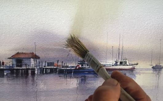
More than just blank space, John Lovett explores how skies can add balance and ambiance to a painting

With landscape-based paintings, no matter what the main subject is, the problem of what to do with that empty bit at the top often seems to crop up. It should be considered in the planning stage of a painting, not as an annoying space to be dealt with toward the end. The sky can have a big impact on, not just the balance of a painting, but the general atmosphere of the work you create. In this article, we will explore different approaches to painting skies and their effect on the balance and atmosphere of the final result.
This story is from the August - September 2021 edition of International Artist.
Subscribe to Magzter GOLD to access thousands of curated premium stories, and 10,000+ magazines and newspapers.
Already a subscriber? Sign In
MORE STORIES FROM International Artist

International Artist
Rugged Beauty
Heavy body acrylics, bristle brushes and palette knives lend a rough, yet serene quality to Karin Nelson's paintings
1 mins
February/March 2026

International Artist
Buildings with Character
In every issue of International Artist we feature a Painting Workshop from Richard Robinson, one of New Zealand's best artists
2 mins
February/March 2026

International Artist
The Director
Casting characters, designing sets and building props, visionary artist Ramón Hurtado brings his love of storytelling and academia into his artwork
3 mins
February/March 2026

International Artist
Words of Wisdom from the 2026 Art of the Portrait Faculty Artists
The Portrait Society of America is thrilled to celebrate another year dedicated to portraiture during our 28th annual The Art of the Portrait conference taking place in Atlanta, Georgia from April 9 to 12, 2026.
5 mins
February/March 2026

International Artist
Step by Step: Baroque Recycling
My painting Baroque Recycling stems from a deliberate collision between historical grandeur and contemporary urgency.
1 mins
February/March 2026

International Artist
Gentle Harmonies
Lena Rivo carefully chooses her colors before applying them to a high-grit paper to achieve her delicate pastels
1 min
February/March 2026

International Artist
Good Things Happen
Harley Brown's fascinating things no one else will tell you
5 mins
February/March 2026

International Artist
Crystal Clear
Elo Wobig demonstrates her approach for achieving depth and translucency in water scenes
1 mins
February/March 2026

International Artist
Light Is Everything
Calvin Liang delves into his process for capturing the warmth, energy and movement of light
1 mins
February/March 2026

International Artist
Shelter from the Storm
A new body of work by eco artist Jon Ching offers respite in a chaotic world
4 mins
February/March 2026
Translate
Change font size