Prøve GULL - Gratis
colour
Living Etc UK
|September 2022
A gallery of bright extensions to show how a carefully crafted palette of shades can easily make your project stand out from the crowd

BOLD SELECTION
Mat Barnes, a director at CAN, designed this cheerful rear extension for his family. The scheme was inspired by mountainous landscapes - but more specifically, the Matterhorn Bobsleds ride at Disneyland. 'The colours were picked to celebrate each of the different architectural elements,' says Mat. Eclectic materials, including worktops and kitchen fronts made from recycled chopping boards/milk bottle tops, terrazzo floors and a concrete wall contribute to the eclectic array of hues. The exposed bricks have been painted in Valspar's Keep Calm, the underside of the staircase in RAL Dahlia Yellow, with RAL Traffic Red and RAL Sky Blue for the steels.
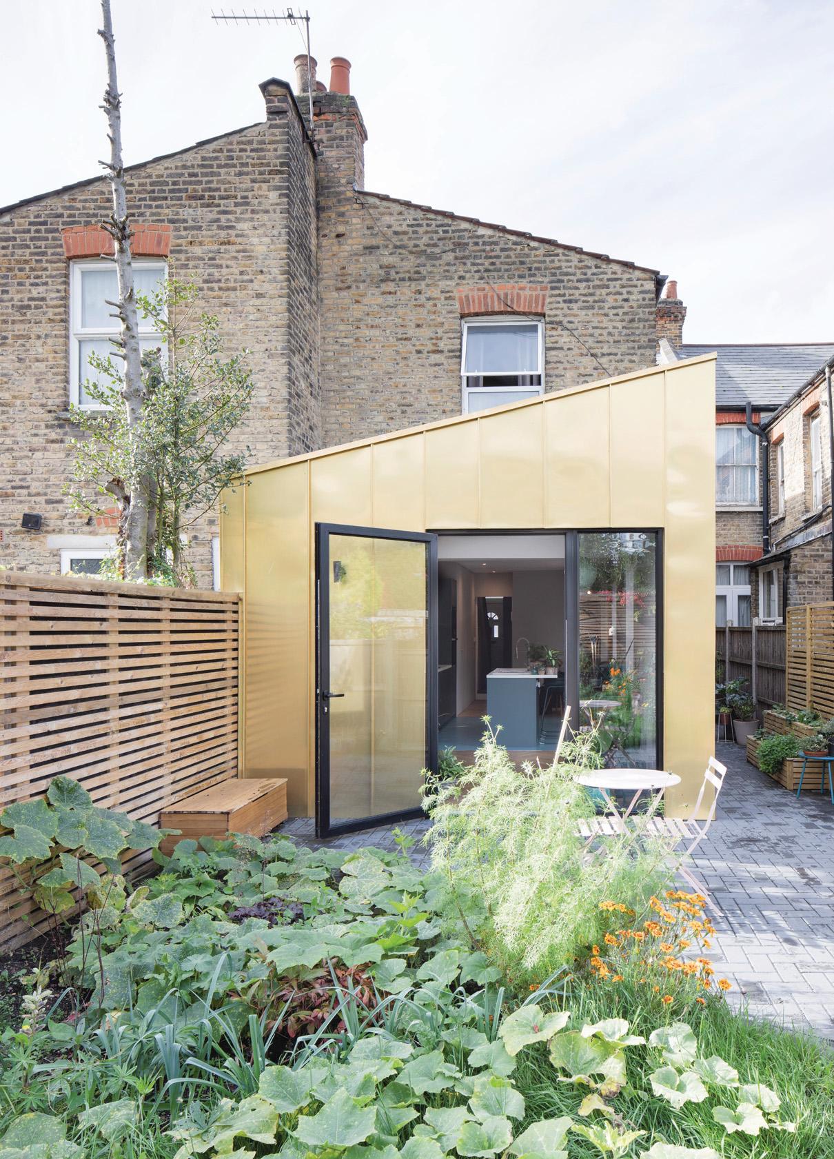
GOLD STAR
This wow-factor extension in north London replaces the cramped lean-to structure that previously sat at the back of the house. 'The gold zinc was chosen to contrast with the pared-down colour palette of the internal space, while complementing the rich shade of the London stock brick,' says James Dale, director at James Dale Architects. 'To create a similar look, I'd suggest starting with the big decisions, like external finishes. From there, build up the materials palette as the design progresses.'
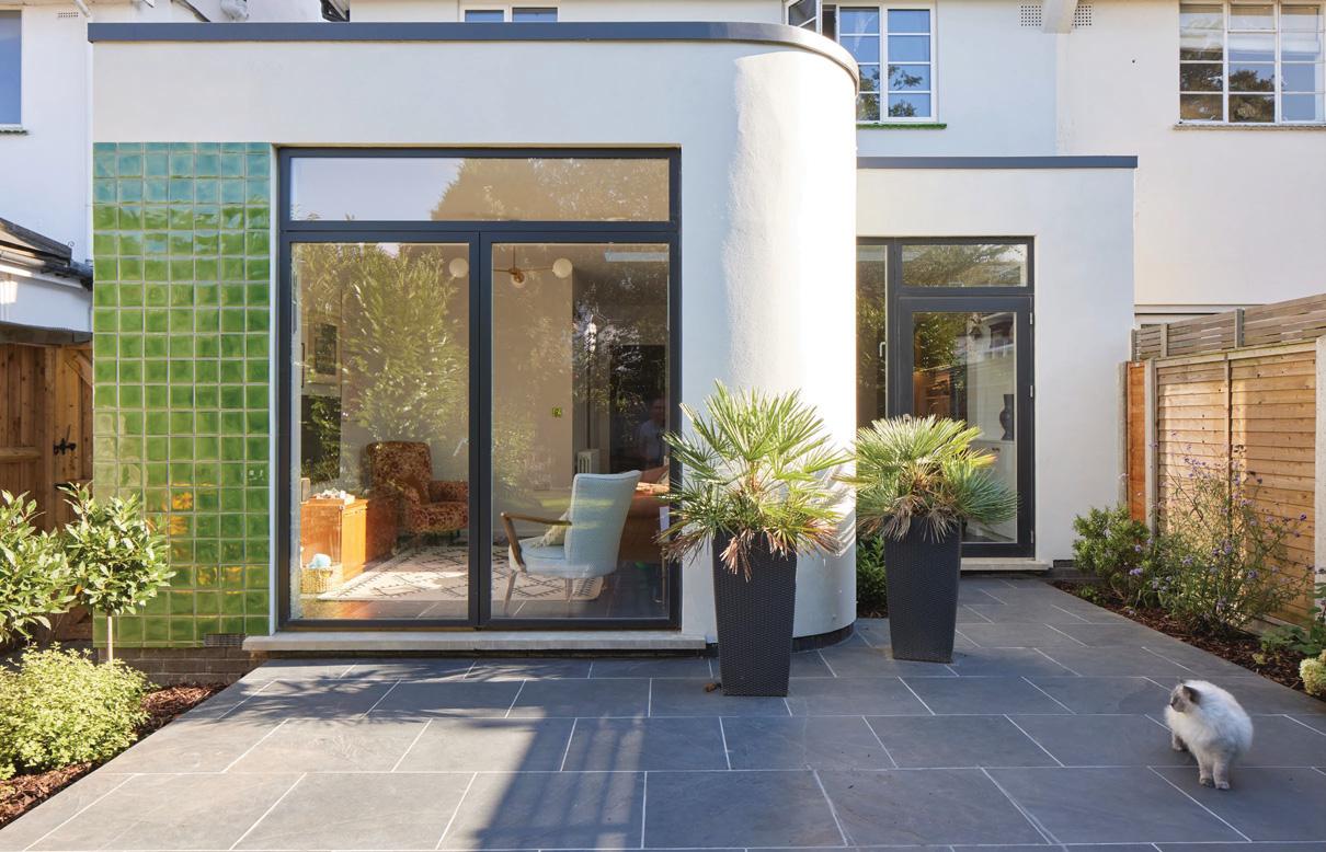
GOING GREEN
Denne historien er fra September 2022-utgaven av Living Etc UK.
Abonner på Magzter GOLD for å få tilgang til tusenvis av kuraterte premiumhistorier og over 9000 magasiner og aviser.
Allerede abonnent? Logg på
FLERE HISTORIER FRA Living Etc UK

Living Etc UK
RHYTHM OF THE NIGHT
A NEW, CIRCADIAN-BASED MICRO TREND IN AMERICAN LIGHTING IS SHINING A SPOTLIGHT ON HOW TO ENHANCE BRITISH HOMES TOO
3 mins
January 2026

Living Etc UK
House rules
As the ultimate tastemaker and founder of Collagerie, Lucinda Chambers knows how to curate perfect moments - this is how her home is always party-ready
1 mins
January 2026

Living Etc UK
FITTED & KITTED
DESIGNERS SHARE SAVVY WAYS TO USE BUILT-IN FURNITURE FOR A HOME THAT'S BEAUTIFULLY ORGANISED
3 mins
January 2026

Living Etc UK
BEHIND THE CURTAIN
THE SHELF SKIRT BRINGS A SOFTER SIDE TO YOUR HOME'S STORAGE - WHILE HIDING YOUR LESS AESTHETIC CLUTTER
1 min
January 2026

Living Etc UK
the big idea
NEAT AND TIDY
1 min
January 2026

Living Etc UK
the hot spot
AMERICAN DREAM
1 min
January 2026

Living Etc UK
Dinner plans
Banquette seating, sculptural tables and more – these are design ideas to dine out on
2 mins
January 2026

Living Etc UK
buy one thing
BEDSIDE COMPANION
1 min
January 2026

Living Etc UK
Joie de vivre
Creating sophisticated interiors doesn't always mean taking a serious approach – just look at this very chic Parisian apartment and its happy-go-lucky vibe
4 mins
January 2026

Living Etc UK
Present and correct
The chicest homes are those where art, objets and niche collections are curated and on display for all to see
1 mins
January 2026
Translate
Change font size