試す 金 - 無料
Fifties pastel
Livingetc India
|June 2020
For both classic decor styles and modernist interiors...
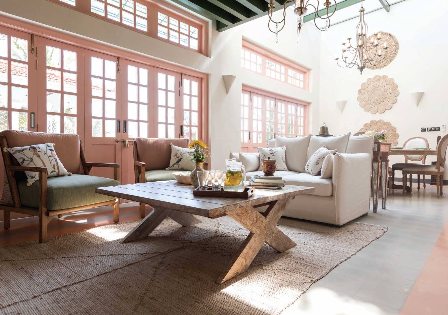
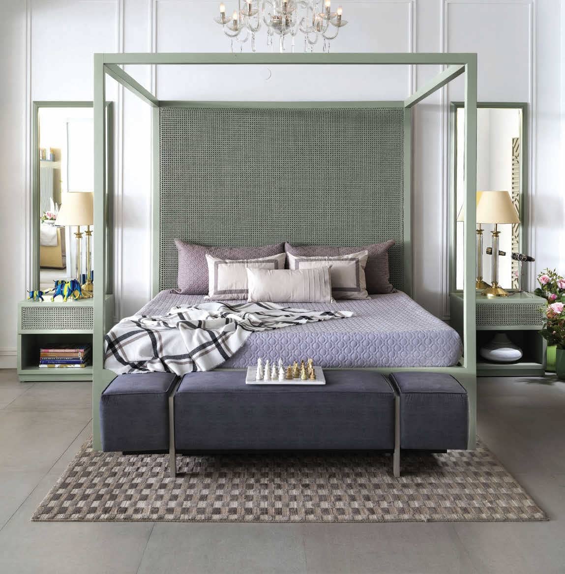
Pastel colours have made their return in the summer of 2020, and whilst powder pink and soft peach are the calling card for pastel interiors, there is a whole world of delicate hues to discover for every style of home.
According to Ar. Aparna Kaushik, the 50s was a time when in architecture, interiors or fashion, there was a more structured form: think Audrey Hepburn’s classic look. “So, whether furniture or clothes, there was a surge of solid, straight lines with a clean look. This is where the pastels came in to complement the structured designs. Pastels are soothing and calming, they never hurt your eyes, so they are never going to go out of fashion. They are like the background music. Also, pastel shades combined with bold designs, solid forms and lines bring about a softness to make an eye-catching statement,” she elaborates.
このストーリーは、Livingetc India の June 2020 版からのものです。
Magzter GOLD を購読すると、厳選された何千ものプレミアム記事や、10,000 以上の雑誌や新聞にアクセスできます。
すでに購読者ですか? サインイン
Translate
Change font size