
Mit Magzter GOLD unbegrenztes Potenzial nutzen
Erhalten Sie unbegrenzten Zugriff auf über 9.000 Zeitschriften, Zeitungen und Premium-Artikel für nur
Fifties pastel
Livingetc India
|June 2020
For both classic decor styles and modernist interiors...
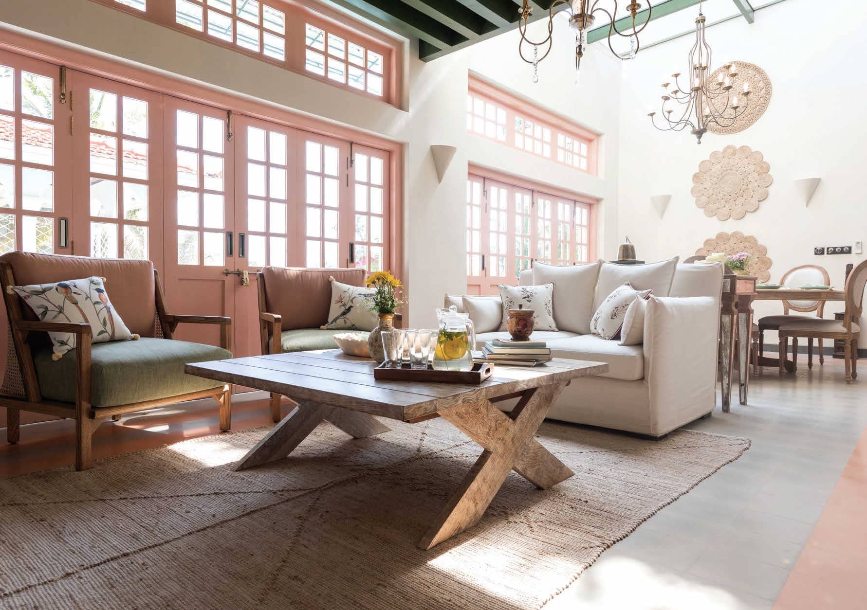
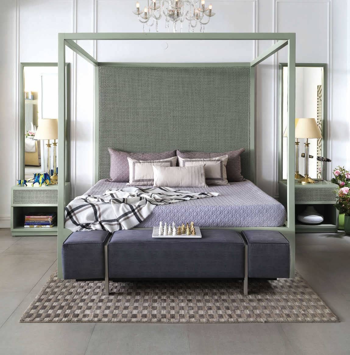
Pastel colours have made their return in the summer of 2020, and whilst powder pink and soft peach are the calling card for pastel interiors, there is a whole world of delicate hues to discover for every style of home.
According to Ar. Aparna Kaushik, the 50s was a time when in architecture, interiors or fashion, there was a more structured form: think Audrey Hepburn’s classic look. “So, whether furniture or clothes, there was a surge of solid, straight lines with a clean look. This is where the pastels came in to complement the structured designs. Pastels are soothing and calming, they never hurt your eyes, so they are never going to go out of fashion. They are like the background music. Also, pastel shades combined with bold designs, solid forms and lines bring about a softness to make an eye-catching statement,” she elaborates.
Diese Geschichte stammt aus der June 2020-Ausgabe von Livingetc India.
Abonnieren Sie Magzter GOLD, um auf Tausende kuratierter Premium-Geschichten und über 9.000 Zeitschriften und Zeitungen zuzugreifen.
Sie sind bereits Abonnent? Anmelden
Translate
Change font size