Versuchen GOLD - Frei
EVOKE EMOTIONS WITH PASTEL SHADES
ImagineFX
|April 2020
US illustrator AMA is known for her soft and whimsical shades. Here she applies her knowledge of watercolours when painting with pastel design gouache
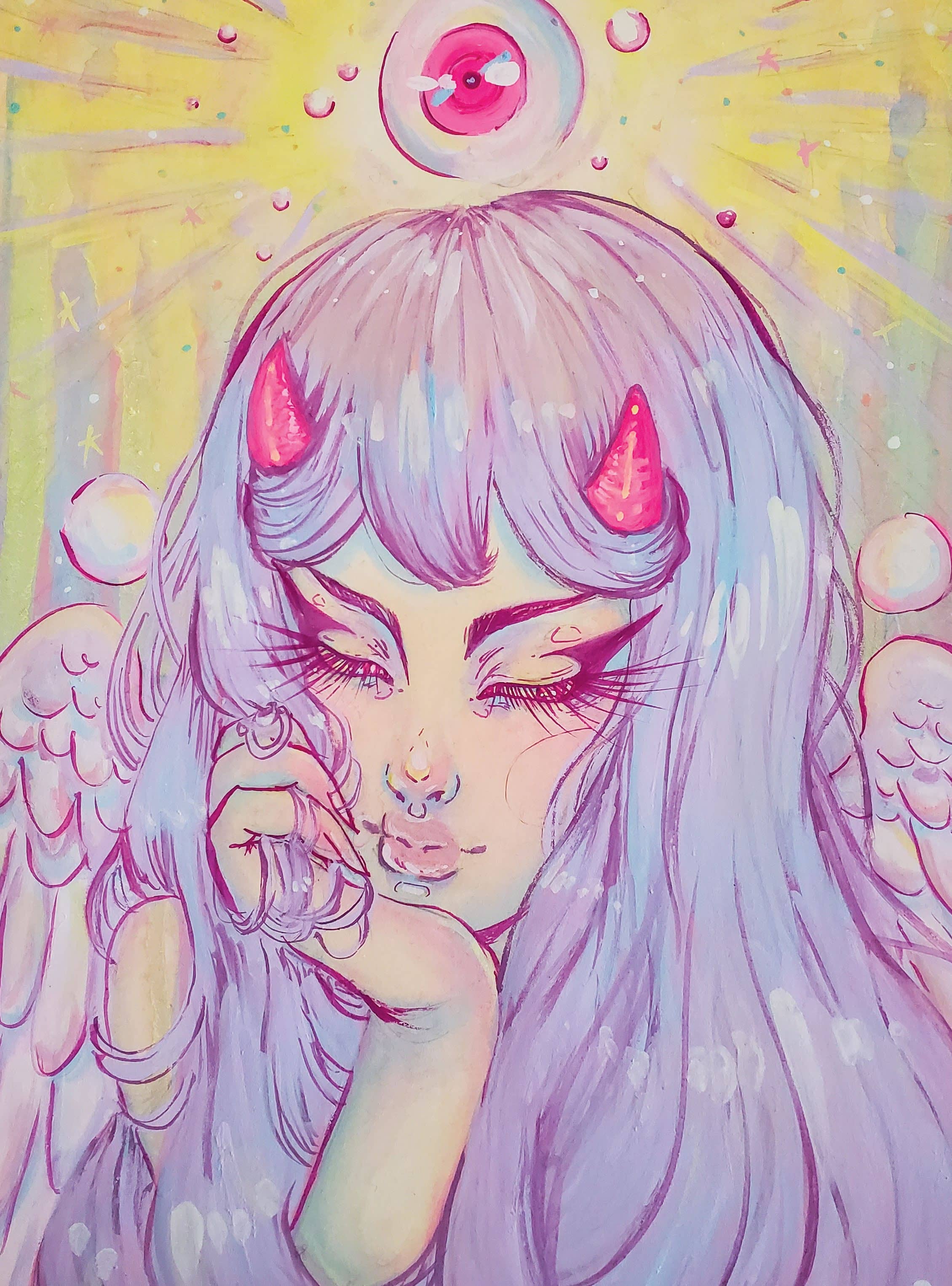
People often ask me why I only paint in shades of pastels even though most of my concepts feel dark and heavy, and where I get my pastel shades from. The answers lie in the fact that ever since I was little, I loved Japanese animation and how colourful the characters would be. Even now, I can’t help but enjoy the protagonist’s brightly coloured hair, going against the grain of all the other characters and I think that’s one of the many areas that influences my colour usage within art.
Over the years I’ve played with the juxtaposition of concept and colour, finding that masking my creations in softer hues helps lift the mood while still retaining the message of the piece. I recently stumbled across design gouache back in 2018. Before then I’d been using watercolours, but encountered many challenges when it came to the desaturation of colours when trying to paint in softer shades.
For those who aren’t familiar, design gouache is essentially opaque watercolour. These aren’t transparent like watercolours hence the word ‘opaque,’ but they reactivate when water is added and can blend in the same fashion as watercolours. They work differently than their gouache counterpart (acryla gouache). Acryla gouache can’t be reactivated when water is applied and is used in the same way as acrylic paint. Design gouache enables me to use similar painting techniques as watercolour that I’m most comfortable with, but still achieve lighter and brighter colours. If you’re looking into gouache, make sure you know the difference between the two types because it does affect how you can paint with them!

Diese Geschichte stammt aus der April 2020-Ausgabe von ImagineFX.
Abonnieren Sie Magzter GOLD, um auf Tausende kuratierter Premium-Geschichten und über 9.000 Zeitschriften und Zeitungen zuzugreifen.
Sie sind bereits Abonnent? Anmelden
WEITERE GESCHICHTEN VON ImagineFX

ImagineFX
ZBrush, Blender & Procreate COLOUR YOUR 3D ARTWORK
Entei Ryu reveals how she sculpts and paints Triceratops and T-Rex, two characters from her BONEGIRL series
1 min
March 2026

ImagineFX
Canon imagePROGRAF PRO-310
Artists and photographers who create gallery-quality prints of their work will want to make room in their studio for Canon's latest printer
1 mins
March 2026

ImagineFX
Acer Swift Edge 14 Al
This beautiful laptop delivers on design, but what about the amount of computing power on offer?
1 mins
March 2026

ImagineFX
CONCEPT A MOODY CYBERPUNK SCENE
Oleg Topor uses a variety of creative techniques to portray a meeting of criminals in the depths of a futuristic city
3 mins
March 2026

ImagineFX
LET THE STORY LEAD THE DESIGN
Nelson Tai takes cues from his personal sci-fi project when constructing a hardworking droid
1 mins
March 2026

ImagineFX
LORCAN THE LITERATE
Arne Billen believes that conceptual contrast can lead to a successful design. He demonstrates this with Lorcan, a character from his D&D campaign who combines literacy with a fighting spirit
1 mins
March 2026

ImagineFX
Secretlab Magnus Evo
REAL STEEL Does this pro sit-to-standing desk rise to the occasion?
1 min
March 2026

ImagineFX
MAKE USE OF FILTERS
Concept artist Brandon Liao gives insights into his visual development work on Spectre Divide
1 mins
March 2026

ImagineFX
ENHANCE ANY 3D MODEL BY APPLYING TEXTURES
Ant Ward explains how UVs and texture maps are an easy way to add detail to a 3D object
1 mins
March 2026

ImagineFX
Karim Yasser Ahmed
Karim is a senior lighting artist with over seven years of experience in AAA games. He loves working on environment lighting: “I treat my environment as a canvas that is getting lit as a painting, and I truly enjoy this process.”
1 min
March 2026
Translate
Change font size