Try GOLD - Free
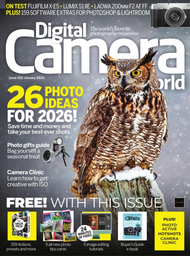
Digital Camera UK Magazine - January 2026
Go Unlimited with Magzter GOLD
Read Digital Camera UK along with 10,000+ other magazines & newspapers with just one subscription
View CatalogSubscribe only to Digital Camera UK
Cancel Anytime.
(No Commitments) ⓘIf you are not happy with the subscription, you can email us at help@magzter.com within 7 days of subscription start date for a full refund. No questions asked - Promise! (Note: Not applicable for single issue purchases)
Digital Subscription
Instant Access ⓘSubscribe now to instantly start reading on the Magzter website, iOS, Android, and Amazon apps.
Verified Secure
payment ⓘMagzter is a verified Stripe merchant.
In this issue
Camera Clinic
Learn how to use ISO creatively and get more from your camera, with top tips from your expert guide Will Cheung
Digital Darkroom
Five new image editing tutorials, plus our latest batch of software extras
Shot of the Month
Wildlife photographer Thomas Vijayan on his award-winning penguin photo
Fujifilm X-E5
Could this new APS-C mirrorless be the best camera yet in the brand’s X-E line?
Laowa 200mm f/2 AF FF
Combines powerful telephoto reach and a fast aperture, minus a premium price tag


Digital Camera UK Magazine Description:
Digital Camera UK Magazine is a magazine aimed at photographers of all levels, from beginners to professionals. Digital Camera UK Magazine features articles on a wide range of topics, including:
* Camera reviews: The magazine reviews new and used digital cameras from all major manufacturers.
* Photography techniques: Digital Camera UK Magazine provides tips and advice on photography techniques, such as composition, lighting, and exposure.
* Photography editing: The magazine covers photography editing software and techniques, such as Adobe Photoshop and Lightroom.
* Photography inspiration: Digital Camera UK Magazine features inspirational photography from around the world.
* Photography gear: The magazine covers all aspects of photography gear, such as lenses, tripods, and filters.
Digital Camera UK Magazine is a must-read for anyone who is passionate about photography. The magazine is known for its high-quality journalism, its informative and engaging articles, and its commitment to providing its readers with the latest news and information about the photography world.
Recent issues

December 2025

November 2025

October 2025

September 2025

August 2025

July 2025

June 2025

May 2025

Spring 2025

April 2025

March 2025

February 2025

January 2025

December 2024

November 2024

October 2024

September 2024

August 2024

July 2024

June 2024

May 2024

Spring 2024

April 2024

March 2024

February 2024

January 2024

December 2023

November 2023

October 2023
Related Titles

The Essential Guide to Portraits 2

Essential Guide to Outdoor photography

The Essential Guide to Landscape Photography 3

The Photographer's Guide to Photoshop

Pocket Guide to Digital Photography

The Ultimate Guide to Digital Photography

The Complete Guide to Home Video

Procrastinate Magazine

Around The World In 18 Days

Ecuador Infinito - Discovering Ecuador

Sandpoint Review: A Photographic Journey

Royce

Canadian Geographic Best Wildlife Photography 2022

Canadian Geographic Best of Wildlife Photography 2024

Canadian Geographic Best Wildlife Photography 2025

Smart Photography

BASICS OF PHOTOGRAPHY

BHUTAN

50 Photo Projects

evo Photo

Heritage Homes

Travellers' World

Whistling Mornings Croaking Nights

African Birdlife

go! Photography

Μεθώνη - Methone

PhotoPlus : The Canon Magazine

N-Photo: the Nikon magazine

Digital Photographer

What Digital Camera