Prøve GULL - Gratis
Paper Textures
August/September 2023
|International Artist
John Lovett guides us through the varying properties of different watercolor surfaces

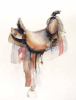
Choosing a watercolor paper can be one of the most confusing aspects of watercolor painting. Each manufacturer offers a number of different textures, weights and sizes plus various paper qualities. Artist quality paper is expensive and needs to be properly treated, before and after use, to keep it in pristine condition. In this article we will look at how to choose a suitable paper and how to handle and preserve your paper.
Paper Texture
Watercolor paper comes in three main textures: smooth (called hot-pressed), medium (cold-pressed or CP) and rough. This photo shows the apparent change in tone due to the shading effect of the progressively heavy textures.
Hot-pressed
The smooth, flat surface of hot-pressed paper is most suited to fine, detailed work. The lack of texture gives the paper a whiter appearance than a textured paper so colors appear more saturated and tonal contrast is more pronounced. Hot-pressed paper is less forgiving when it comes to large washes due to its heavy surface sizing. Blooms can be a problem on hotpressed paper.
Cold-pressed
Cold-pressed paper sits halfway between hot-pressed and rough. It has a moderate texture so there is a slight shadow cast into the tiny pits in the paper. This reduces the appearance of whiteness and desaturates the colors slightly. However the paper is much more forgiving than hot-pressed when it comes to big washes or manipulating drying pigment. Cold-pressed is a good all round paper. It allows for plenty of fine detail while giving your work a subtle underlying texture.
Rough Paper
Denne historien er fra August/September 2023-utgaven av International Artist.
Abonner på Magzter GOLD for å få tilgang til tusenvis av kuraterte premiumhistorier og over 9000 magasiner og aviser.
Allerede abonnent? Logg på
FLERE HISTORIER FRA International Artist

International Artist
Marshland Glow
Through glazing and scumbling, oil painter Karen Murphy manipulates her medium to create atmospheric landscapes
1 mins
August/September 2025

International Artist
Quiet Rhythm
Using deep shadows and a desaturated palette, Daria Antonova creates townscapes imbued with emotion
1 mins
August/September 2025

International Artist
To the Point
Keita Tsuji uses pointillism to heighten the color expression in his pastel paintings
1 mins
August/September 2025

International Artist
Change Up
Primarily a watercolor artist, Heidi Willis breaks down her approach to working with a new medium
2 mins
August/September 2025

International Artist
Form and Space
Alicia Ponzio's interest in human anatomy guides her sculptural works
2 mins
August/September 2025

International Artist
The Texture of Time
Bennett Prize winner Amy Werntz create works of art that celebrate the beauty that only comes with age
5 mins
August/September 2025

International Artist
Pattern making
My painting process is predominantly intuitive.
1 min
August/September 2025

International Artist
The Big Picture
Tony Thielen paints bold, expressive scenes by starting with the biggest shapes, then working toward the finer details
1 mins
August/September 2025

International Artist
Fluid Fusion
Pigments merge and create subtle gradients in Ian de Hoog's traditional wet-in-wet approach
2 mins
August/September 2025

International Artist
MAKING MOVES
How to pitch your work to the press
4 mins
August/September 2025
Translate
Change font size