WHAT ARE COMPLEMENTARY COLORS?
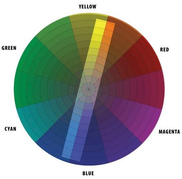
Two colors are called complementary when they have opposite or balanced color characteristics, such as blue vs. yellow-orange or green vs. red-violet. Complementary hues appear across from each other on the color wheel. When you mix two such pigments together, they make gray or black. Mixing two complementary sources of light yields white light. When you stare at one hue for an extended period of time, the afterimage that emerges is the complementary color. These oppositional pairs are related by their antagonism. One balances the other, like riders on a seesaw. They cancel each other out, but they also amplify each other when used together in a picture.
Let’s examine complementary relationships by doing some paintings composed entirely of the two colors in the complementary pair, and leaving out the rest of the hues. So in the color wheel here, we’ll only use the blue/orange colors inside the central rectangle, and we won’t have access to the greens and magentas. We’ll start by doing some experiments in the studio and then applying what we learn in a few demonstrations.
EXERCISE 1: TRAN-OPAQUE COMPLEMENTARY BLEND
This story is from the Station Points edition of International Artist.
Start your 7-day Magzter GOLD free trial to access thousands of curated premium stories, and 8,500+ magazines and newspapers.
Already a subscriber ? Sign In
This story is from the Station Points edition of International Artist.
Start your 7-day Magzter GOLD free trial to access thousands of curated premium stories, and 8,500+ magazines and newspapers.
Already a subscriber? Sign In

Intrigue in the ordinary
I've \"'ve never had any formal training always had a strong attraction to the arts and the practice of painting

Paper Textures
John Lovett guides us through the varying properties of different watercolor surfaces

Creating Ambiance
Mona Parker Weidner selects colors palettes and light sources that emphasize the mood of her interior scenes

Visual Depth
Blending and smoothing with solvents, Holly Siniscal creates painterly portraits in colored pencil

Sharp Precision
Working with craft blades and tattoo needles, Conor Smith etches realistic renderings of wildlife

The architecture of water
When Then I moved from Toronto to a tiny community in Nova Scotia, I became fascinated by the ocean, its reflections and endlessly shifting patterns of color and light

Saturated World
Emphasizing the beauty of nature, Joe A. Oakes paints landscapes with warm colors and imaginative compositions

Pure Bliss
Working alla prima, Andreas Liss takes on a loose, unbridled approach in his artwork

Sculpting the Paint
Using a palette knife allows oil painter Maria Iva to create clean colors and rich textures

Forwad MOMENTUM
Artist Lisa Gleim shares the evolution of her career and how she grew into her preferred medium of pastels