試す 金 - 無料
In conversation with Hansje van Halem
Computer Arts - UK
|March 2020
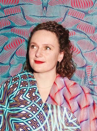
Hansje van Halem is known for her mesmerizing pattern designs … or are they letters? We caught up with the master of ornamental typography to hear about her experiments with legibility

At what point does a letter stop being a letter? It’s a question that Hansje van Halem constantly tackles in her work. The graphic designer’s creations can be found on posters, books, and increasingly out in the wild, in locations such as bike tunnels and airports. For the past three years, she has been the head designer for Dutch music festival Lowlands, where her type design scheme has been transformed into a flexible algorithm for the whole team to work with.
Van Halem talked through her complex, mesmerizing body of work at the recent Design Manchester Festival. We spoke to her in a break about typographic algorithms, old-school lettering machines, and pushing the boundaries of legibility.
In your words, how would you describe your typographic style?
It’s experimental, of course. It’s researching the balance between legibility and illegibility; between pattern and type. And it focuses on texture and ornament.
You’ve spoken about the ‘rules’ of type design. In your work you’re pushing against these rules. Is that what interests you about working with letters?
このストーリーは、Computer Arts - UK の March 2020 版からのものです。
Magzter GOLD を購読すると、厳選された何千ものプレミアム記事や、10,000 以上の雑誌や新聞にアクセスできます。
すでに購読者ですか? サインイン
Computer Arts - UK からのその他のストーリー
Computer Arts - UK
Creative Space
Without’s creative director roly grant on the studio’s hand-crafted ethos
2 mins
June 2020
Computer Arts - UK
studio profile
A leading light in the branding industry, Wolff Olins wants to harness its scale to help change the world
8 mins
June 2020

Computer Arts - UK
network
THE CREATIVE COMMUNITY HAS COME TOGETHER LIKE NEVER BEFORE, TO HELP EACH OTHER GET THROUGH THE CORONAVIRUS PANDEMIC
2 mins
June 2020

Computer Arts - UK
project
ethos for 305 Fitness - Learn how the Montreal identity design studio rebranded one of America’s hottest fitness clubs
5 mins
June 2020

Computer Arts - UK
rebrand
WHAT’S THE EXPERT OPINION ON PENTAGRAM’S BRAND IDENTITY REFRESH OF THE GLOBAL TOY COMPANY FISHER-PRICE?
3 mins
June 2020
Computer Arts - UK
opinion
CRAIG BLACK HAS SOME ADVICE FOR SURVIVING THE CORONAVIRUS CRISIS AS AN INDEPENDENT CREATIVE
5 mins
June 2020

Computer Arts - UK
fresh eyes
DUNCAN BRAZZIL ON HOW THE UK INSPIRED HIS CAREER
1 min
June 2020

Computer Arts - UK
artist insight
Cindy Kang on how photography informs her illustration work
5 mins
June 2020
Computer Arts - UK
ANIMATION NOW
LEADING PRODUCERS AND FILMMAKERS REFLECT ON EMERGING TRENDS AND SHARE THEIR PREDICTIONS FOR THE YEAR AHEAD
17 mins
June 2020
Computer Arts - UK
Project: Atoll by Studio Myerscough
Morag Myerscough reveals how she and Luke Morgan designed a vibrant biophilic installation in a central London office tower studiomyerscough.com
4 mins
May 2020
Translate
Change font size