Some trends dictate an era, but some trends will have a perennial chapter in the books of history. Whether you are a design traditionalist or a decor maverick, these six trends will surely grab your attention

Clashing pairings
There is no ‘design-law’ that forbids you from mixing two elements who by nature are opposites. Pair aged, distressed hardwood floors with stainless steel elements, ultra-modern tables and chairs, or retro glass chandeliers. Although not an entirely new approach, pairing muted neutrals with bold, primary colours is another example of clashing complimentary elements. Incorporating different patterns into your decorating scheme can be incredibly intimidating. But layering patterns is an art in itself and pays off in the end. The trick is to combine prints in different styles and scales. Trust us with the right choices the finished space will harmonise the pairings in unexpected ways.
Colourful kitchens
We are always focused on the fixtures and fittings for the kitchen; take care of even the smallest details, but never experiment a lot when it comes to colour. Spoiler alert: You can use every possible colour of the rainbow and still get a gorgeous looking space to make your most favourite dishes. From splashy modernism to rustic industrialism, we have seen it all. Yet those brightly coloured cabinets are the ones that get stuck in our minds. This trend is in its true sense the underdog in decor trends.
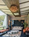
Geometrical shapes
This story is from the February 2019 edition of The Ideal Home and Garden - India.
Start your 7-day Magzter GOLD free trial to access thousands of curated premium stories, and 8,500+ magazines and newspapers.
Already a subscriber ? Sign In
This story is from the February 2019 edition of The Ideal Home and Garden - India.
Start your 7-day Magzter GOLD free trial to access thousands of curated premium stories, and 8,500+ magazines and newspapers.
Already a subscriber? Sign In
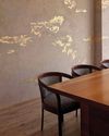
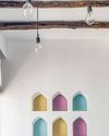
Textures: A Game Changer For Interiors
Fed up of plain old walls? Why not give your interiors a wow factor by texturing your walls.
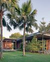
HOUSE OF GREENS
Dubbed as The Floating Frame, the home enveloped by the greens is designed and owned by Rushi Shah Architects and family, who are nature lovers and wildlife photographers.
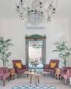
SPELLBINDING MOROCCAN MAGIC
Leisure, tranquillity and adaptation of a traditional Moroccan house are the key elements of this home in Ahmedabad.

CRAFTING HOME STORIES
Three inspiring women entrepreneurs who are building successful businesses based on art and craft
BACHELOR PAD BLISS!
Catering to the needs of its owner’s life and lifestyle, TIHG has assembled together Bachelor Pads that have been designed with a creative approach and a novel vision that enchants. Peruse through these varied examples that convey their own unique charm.
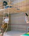
PLAYFUL ABODE
The home in Ahmedabad that is designed for two girls, 3 and 9 respectively, as per their fancies and to appeal to their sensitivities.
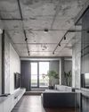
CONSCIOUSLY CONCRETE!
It almost goes without saying that concrete is the new trend in interiors. From statement walls to textured floors, these grey designs have now become a focal point. convincing and offbeat, let's check out how these phenomenal designers have charmingly justified concrete to be one of the best choices in decor!
MAY
THE TIME TO RELISH STAYING INDOORS AND ENHANCING YOUR INTERIORS USING DIYS THAT FUEL CREATIVITY AND AESTHETICS
COMFORT LIVING
Inspired by the Moroccan style and design elements with a contemporary touch define the design of this home in Ahmedabad.
A MAYHEM OF HARMONY
Located at the astounding “Raichak on Ganges” and serenaded by the breeze of the Ganges River, the BMA Villa is a resplendence to the vogue in design.