Whether you're a newbie to painting or a seasoned pro, experimenting with basic principles can stimulate your thinking and focus your field approach. In this article, the first in a series, let's explore what we can accomplish with black and white. We'll discover how a patch of gray looks different when it's made of transparent black compared to an opaquely mixed gray. We'll see what insights we can glean from other simple studio exercises, and apply them to real-world situations.
REDUCE THE VARIABLES
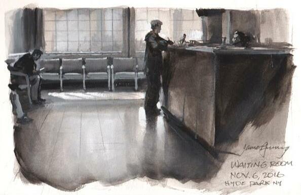
When you visit an art supply store, you are confronted with a bewildering array of colors to choose from. If you're just learning to paint, or if you're trying out an unfamiliar painting medium, it helps to reduce the variables. That way you can concentrate on just one of the three dimensions of color, namely value, and you can deal with hue and chroma later. Let's start with the smallest combination of pigments possible: ivory black and titanium white.
Pure black and white is a completely valid choice on its own terms for creative expression, especially when you want a stark, moody feeling. And it has practical benefits. If you're trying out a new kind of paint, such as gouache or casein, you don't have to invest in the full color set. When you go on location, you only need to bring two tubes of paint, and they're ideally suited to painting in limited light environments.
EXERCISE 1: COMPARE TRANSPARENT AND OPAQUE
This story is from the Station Points edition of International Artist.
Start your 7-day Magzter GOLD free trial to access thousands of curated premium stories, and 8,500+ magazines and newspapers.
Already a subscriber ? Sign In
This story is from the Station Points edition of International Artist.
Start your 7-day Magzter GOLD free trial to access thousands of curated premium stories, and 8,500+ magazines and newspapers.
Already a subscriber? Sign In

Intrigue in the ordinary
I've \"'ve never had any formal training always had a strong attraction to the arts and the practice of painting

Paper Textures
John Lovett guides us through the varying properties of different watercolor surfaces

Creating Ambiance
Mona Parker Weidner selects colors palettes and light sources that emphasize the mood of her interior scenes

Visual Depth
Blending and smoothing with solvents, Holly Siniscal creates painterly portraits in colored pencil

Sharp Precision
Working with craft blades and tattoo needles, Conor Smith etches realistic renderings of wildlife

The architecture of water
When Then I moved from Toronto to a tiny community in Nova Scotia, I became fascinated by the ocean, its reflections and endlessly shifting patterns of color and light

Saturated World
Emphasizing the beauty of nature, Joe A. Oakes paints landscapes with warm colors and imaginative compositions

Pure Bliss
Working alla prima, Andreas Liss takes on a loose, unbridled approach in his artwork

Sculpting the Paint
Using a palette knife allows oil painter Maria Iva to create clean colors and rich textures

Forwad MOMENTUM
Artist Lisa Gleim shares the evolution of her career and how she grew into her preferred medium of pastels